Recently, Leggett’s two new bedding models paid a little visit to our IDEA Center. Actually, there was nothing “little” about it: Cindy and Betty weigh in at 8,500 and 9,000 pounds respectively. The elephants will be featured in upcoming promotional materials for a new bedding product line.
-
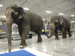
- Our new bedding models, Betty and Cindy
-
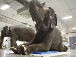
- Laying down was actually part of the job description.
-
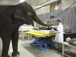
- Betty sticks her nose into the technical specs of the product.
-
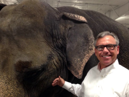
- John Walsh, Staff VP of Creative Services (He’s the one on the right.)
-
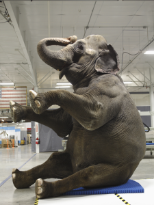
- Cindy said the product really improved her posture…but of course, she is used to sitting on hay.


 33 Things Everyone Should Stop Doing In Their 30s
 Our copywriters picked their favorite–or least favorite–articles of the week to share. Bonus: they weigh in with their own opinions through some back-and-forth conversation.
 We’re switching up the format for “A Linking Mess.” This week, Shela Ward and Paul Johnson (members of our Creative Services team) both weigh in on two articles that made the rounds in social media recently.