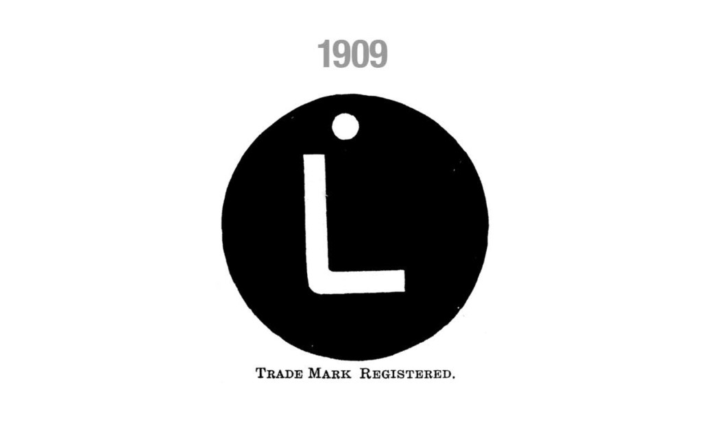
Leggett & Platt has been in business for over a century, but our logo has undergone relatively few changes in that time. The one major change came in the early 1970s, when we moved from a simple “L” to a script typeface. I sat down with Leggett’s Creative Director, Scott Clark, to discuss the history of the logo.

In the early days, this metal tag was attached to every Leggett product and eventually became the official logo. The circle in the design was actually a hole used for fastening the tag to springs and frames. “I love the simplicity of this design,” stated Clark. “It’s fascinating how well it holds up–what looked good 100 years ago still looks good today, and that’s not always the case.”
