Leggett & Platt has been in business for over a century, but our logo has undergone relatively few changes in that time. The one major change came in the early 1970s, when we moved from a simple “L” to a script typeface. I sat down with Leggett’s Creative Director, Scott Clark, to discuss the history of the logo.
In the early days, this metal tag was attached to every Leggett product and eventually became the official logo. The circle in the design was actually a hole used for fastening the tag to springs and frames. “I love the simplicity of this design,” stated Clark. “It’s fascinating how well it holds up–what looked good 100 years ago still looks good today, and that’s not always the case.”
This version added both weight and depth, evolving from the simple bent line into the block “L”. Clark continued, “The upper part of this design feels more like a word mark whereas the circle L is more likely the official logo.”
The “L” tag was simplified but the primary elements remained. Clark pointed out, “The company now has some history, and it’s added to the design here. The new locations in Kentucky and Texas are also included. Besides print ads, you would also see this painted on the sides of our trucks.”
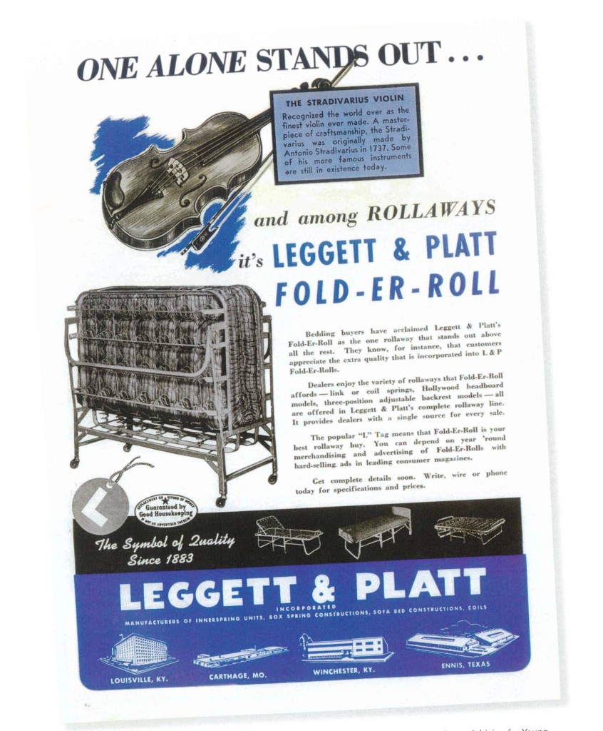
In the early 1950’s, advertisements like this were commonly placed in magazines like Good Housekeeping or Living for Young Homemakers.
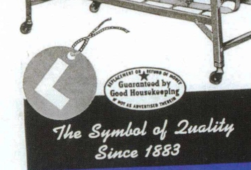
The copy from the above advertisement stated, “The popular ‘L’ tag means that Fold-Er-Roll is your best rollaway buy.”
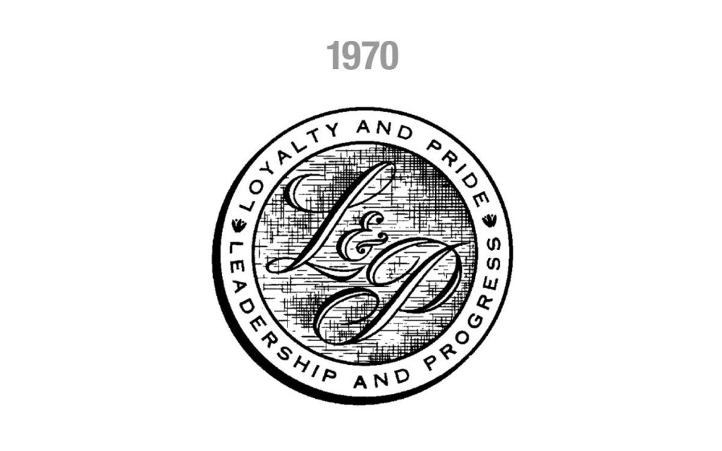
“The L and the P was derived from the signature of J.P. Leggett,” Clark said. “If you see his signature, you’ll see that our current logo resembles his penmanship.”
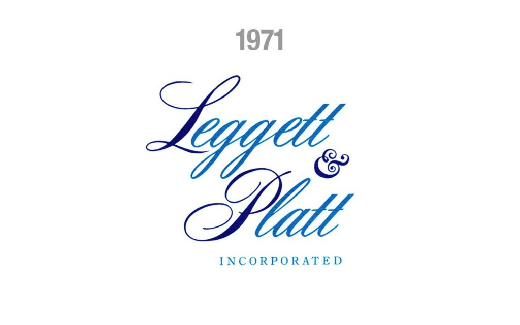
When describing the first iteration of our current script logo, Clark drew attention to the ampersand. “You’ll notice that it’s the only thing that really changes between the designs since 1970. Also, back then, these were all hand-lettered without the aid of computers.”
The script version transitions from the 1971 stacked format to horizontal. At the time, CEO Harry Cornell, Jr. stated that “being a components supplier to the bedding and furniture industries was our greatest opportunity for profitable growth.” Clark noted that as we became more diversified we eventually outgrew the “components people” slogan.
- “There were only two changes made in 1997,” said Clark. “We added the registration mark and adjusted the text slightly. Compressing ‘incorporated’ and shifting it to the right adds some balance to the design. This is currently the official company logo.”
You’ll notice the classic logo has been approved for use as a profile image on Facebook and LinkedIn. Clark loves this approach. “I would love to revisit this design,” he said. “It’s a nod to our roots. It’s so old that it’s become fresh again; it’s much more fresh than some of the designs in between.”
There are some other designs floating around the Leggett offices. One of them is the “cat in a coil” that was popular for many years. Another is a 3-D representation of “L&P”. Clark explained that neither of those designs was ever an official logo. They were simply icons used by marketing at different times in the company’s history.

